
VHS Revival brings you some of the finest promotional treats of the 1980s
Brain Damage (French Version) (1988)
I begin with a personal favourite: a French poster for low-budget horror satire Brain Damage — or ‘Elmer’ as it is known in this poster’s country of origin. If you haven’t seen Brain Damage (and many of you probably haven’t) it is the story of a parasitic entity that forms symbiotic relationships with its victims by injecting a highly addictive hallucinogen into their brains. Once that irresistible carrot has been dangled, the creature known as Aylmer (different spelling) begins to establish its dominance, sadistically starving its victims to the point of insanity and continuing to do so long after they have submitted to his macabre demands.
What does Aylmer want in return for his precious juices? The answer is deliciously portrayed in the below poster. Aylmer is an insatiable scourge who feasts on human brains with the unabashed glee of a kid in a candy store, jumping from enabler to enabler with a sardonic wit that this image encapsulates so exquisitely.

Though blockbuster features would have considerably larger funds at their disposal, many of the most striking or memorable examples of promotional art came out of the VHS boom, which would depend on promotional art to sell inferior productions in what would quickly become an oversaturated market. Some of those images were far superior to the movies that they represented, but exploitation director Frank Henenlotter’s Brain Damage more than holds its own.
For those intent on digging out this underappreciated treat, I don’t want to give too much away. Let’s just say that the effects of long-term alien drug abuse are positively head-splitting.
A Nightmare on Elm Street (1984)
After unearthing a lesser-known gem, I’ll return to the classics and an image that hinted so cleverly at a future horror icon. There are numerous posters for the original A Nightmare On Elm Street, but for my money the most relevant is this Graham Humphreys British quad that would come to be known as version three, though in my opinion it is easily number one.
By the late 1980s, Fred Krueger had become horror’s first bona fide rock star, a series of increasingly preposterous sequels focusing on overblown practical effects set-pieces and the kind of cringeworthy puns that smacked of youth-oriented marketing, but back in 1984 Wes Craven’s once in a lifetime dream concept breathed new life into the flailing slasher genre thanks to the filmmaker’s resourceful artistry and the inimitable star turn of horror legend Robert Englund.
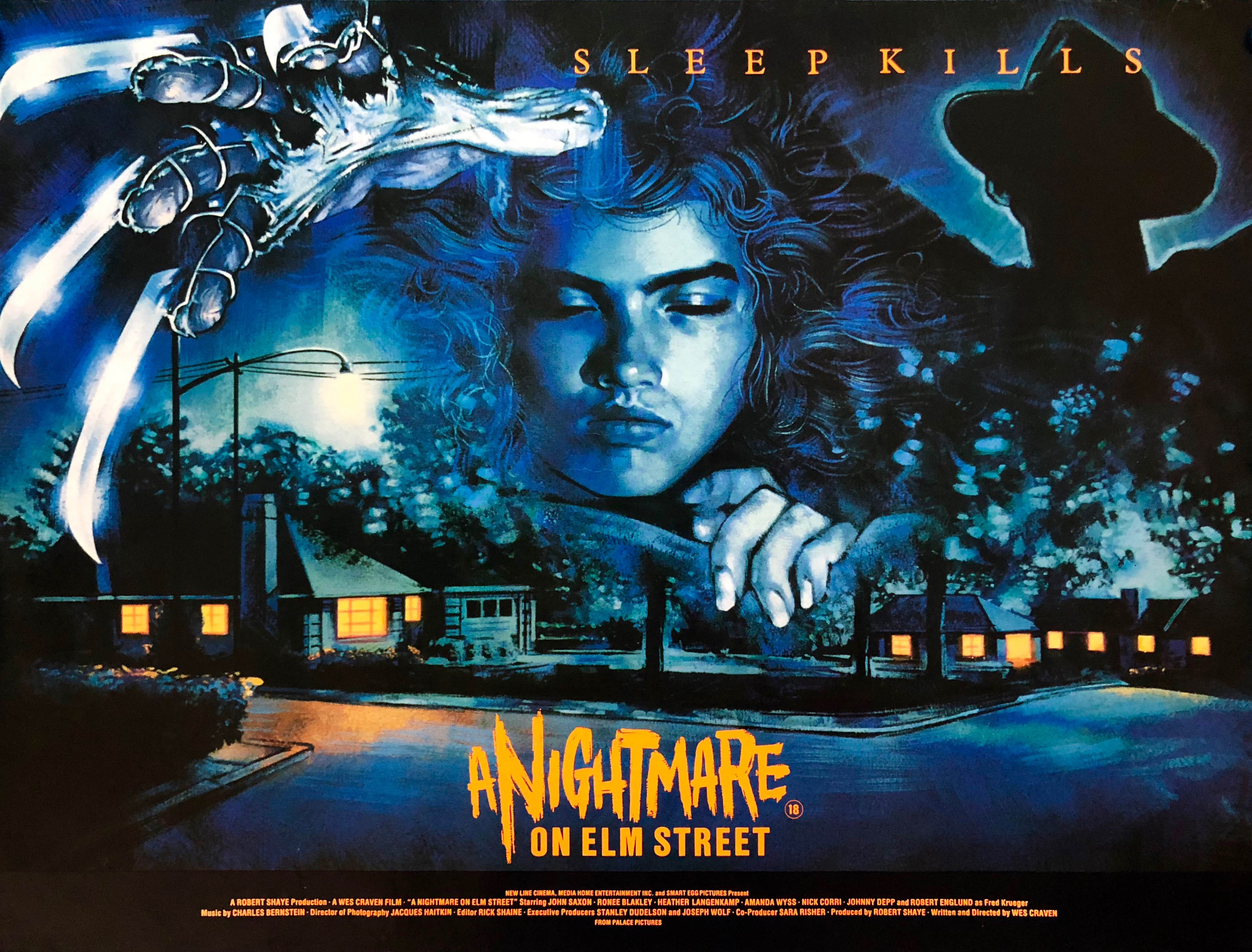
The above poster encapsulates the original concept so exquisitely. Here we see final girl Nancy sleeping as she gets set to do battle with the crude shadow that haunts the periphery of her dreams. There is also the introduction of the killer’s sexually suggestive razor-fingered glove, his prey’s cover-clinging melding into a suburban neighbourhood that has become lost in the recesses of Freddy’s dream world omnipotence.
The fact that Krueger takes a certain prominence without dominating the canvas suggests an awful lot about the movie’s content, as does the row of oblivious house lights aligning Elm Street. Add to this the contrast of ethereal blues and stark orange and you have a movie poster masterpiece that oozes quiet symbolism.
They don’t make them like this anymore.
Creepshow 2 (1987)
I must admit, I have a real soft spot for Creepshow 2, a sub-par, tongue-in-cheek horror sequel consisting of three EC Comics styled segments. It may lack the authentic comic book charm of the original Creepshow, ditching the playfulness for slasher tropes of the more marketable variety, but Romero’s Stephen King-penned trilogy is a nasty little treat that holds a special place in the hearts of many horror fans, and part of that can be attributed to one of the most memorable and befitting promo posters of the decade.

Cut from five shorts to three due to budgetary restrictions, Creepshow 2‘s brand of cheapskate horror may be unpalatable for some, particularly die hard fans of the first movie who view the sequel as a tepid imitation that is unworthy of its predecessor, but you’d be hard-pressed to find someone who feels the same way about its accompanying poster. Ask any child of the 80s to name some of their favourites of the era and this striking image will no doubt rank somewhere near the top.
Though hardly creative in terms of symbolism, you have to admire the technique and raw aesthetics on display. A true classic of the era.
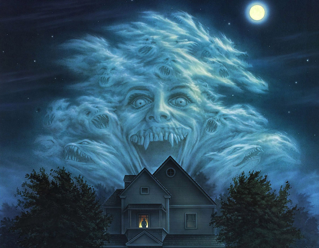
Fright Night (1985)
Fright Night may not be as iconic or as fondly remembered as The Lost Boys, or as marketable or brightly coloured, but as a movie it is much more skilfully defined. Thanks to Tom Holland’s delicious commentary on the decline of Gothic horror and the rise of video nasties, its scares are scarier, its laughs louder, and its setup allows for an altogether richer experience.
The movie stars Roddy McDowall as a thespian ham whose steak-wielding escapades stretch no further than a series of shoddy re-runs on late-night television. That’s until toothy suburbanite Jerry Dandridge moves into Charlie Brewster’s neighbourhood and forces him to reach his true potential.

The accompanying poster — one of the most memorable of any era — is a minor masterpiece of striking simplicity. If you haven’t had the pleasure of seeing Fright Night, everything you need to know is prevalent in perhaps my favourite of all horror posters, complete with toothy titles and a spectacular cloud of bloodsucking ghouls, a solitary figure of quiet isolation standing ominously beneath.
It’s certainly enough to give Peter Vincent the willies!
Friday the 13th (1980)
I promised myself I would include only one poster from the Friday the 13th franchise, and against all of my natural instincts I have gone for the original. I say this because I have never been the biggest fan of a movie that went on to spawn an incredible eight sequels, with a couple of revamps and a spin-off crossover to boot. You might argue that the original is the superior movie of the franchise ― it was the most commercially successful ― but as brilliant a Betsy Palmer is as the deliciously insane Pamela Voorhees, Friday the 13th is all about the madman in the hockey mask, and nothing will ever change my mind.
There were some woeful Jason-led instalments, but at least the franchise had the good sense to reinvent itself as a meta-humour splatterfest, whereas the original was merely a straight-up derivative of John Carpenter’s far superior Halloween. Similarly, there are perhaps better Friday posters out there, but I kind of owe the original instalment a little slack ― it is one of the most memorable films in the slasher sub-genre, after all ― and I choose to pay my dues by showing my appreciation for this wonderful slice of promotional art, a fine example of attractive and resourceful movie marketing.
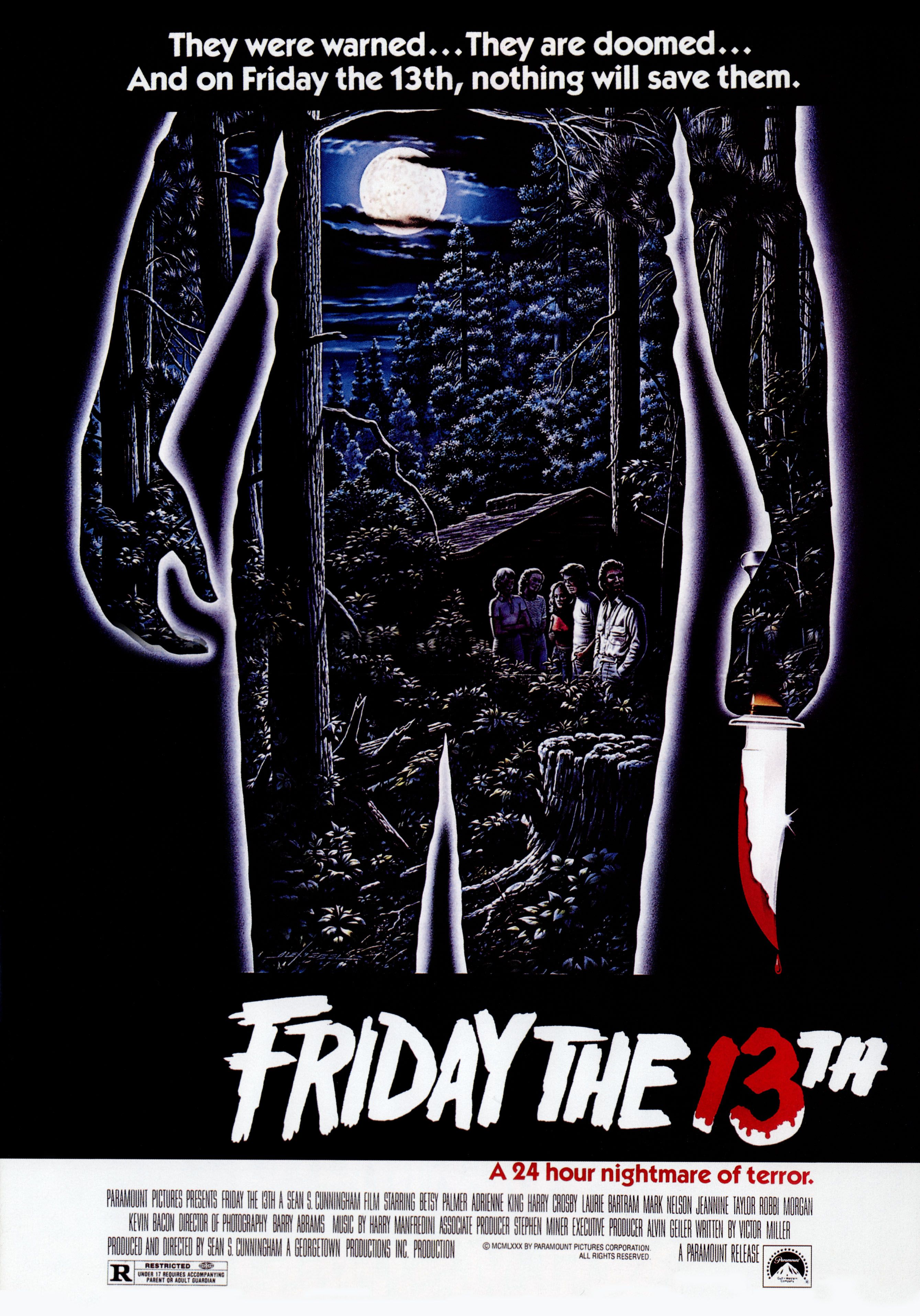
The image is pretty much self-explanatory, which is what makes it so striking. We have the looming figure of the movie’s undisclosed killer, transparent and elusive, the contrast of stark blankness and infinitesimal detail only adding to their anonymity, an aspect that is paramount to a movie whose twist is everything. We even have the classic Friday the 13th logo, and that can’t be a bad thing.
But enough praise from me. I’ve made my peace.
Chopping Mall (1986)
Here we have the kind of savvy misrepresentation that was rife during the home video revolution, and a prime example of the importance of promotional art in the low-budget VHS arena. Jim Wynorski’s Chopping Mall is a tongue-in-cheek sci-fi horror that defies convention while embracing it, but those in charge of marketing clearly felt more comfortable slipping into the realms of the slasher with this sub-genre promo clone.
In reality, the film’s antagonists are a bunch of microwave/toaster hybrids called Killbots who roll around on tank tracks and shoot lasers. Nowhere will you find a robotic hand or a decapitated head in a bag, but those who have seen the movie will know that the Killbots would be a much harder sell to an audience bred on the likes of Jason Voorhees.

Beyond commercial deception there is little scope for visual insight, but the pun tagline captures the tone of the movie perfectly, and stripped of in-depth analysis it still remains one of the more striking images of the decade.
Produced by the wife of schlock master Roger Corman, Chopping Mall has garnered a huge cult following in the years since its release thanks to some absurd visuals and a screenplay that has its tongue buried firmly in its cheek. The above poster is also one of the most sought-after among low-budget horror fans, and certainly one that’s high on my own personal chopping list.
And no, that wasn’t a typo.
The Evil Dead (1981)
Sam Raimi’s The Evil Dead was one of the most ferocious horror movies of the decade. One of 72 horror flicks banned following the Video Recordings Act of 1984, it is an excruciatingly visceral descent into madness, one particularly unsettling forest-bound scene blurring the lines between fantasy and reality.
A marvel of grungy sound design, the movie is one of the most memorable ‘video nasties‘ of a largely shoddy bunch, even inspiring a quasi-sequel that rehashed events with a view to overcoming the censorship no-nos of the MPAA and BBFC censoring bodies.

A UK variation by promo art legend Graham Humphreys is perhaps superior in conveying the movie’s grungy feel and breakneck horror, but this US one sheet is perhaps more iconic, doing a fantastic job of selling the movie and its themes.
The overwrought anguish of the woman screams off the canvas, the zombified hand around her throat symbolic of the movie’s savagely fierce grip and unwillingness to let go. Its contrasting colours, split across the middle, fittingly depict the movie in its most simple and effective terms. The Evil Dead is a straight-up clash between good and evil, and from this lady’s hell-bound predicament, divine salvation seems just a touch out of reach.
The Stuff (1985)
Larry Cohen‘s acerbic satire on consumerism is a delightful treat that’s as addictive as its gooey subject — the story of a parasitic entity which takes brand loyalty to a whole new level by turning its bright-eyed advocates into zombies and feeding on the unconscious remains of its exponents.
The Stuff is very much an ode to 50s sci-fi schlock, a quality made evident by its promotional poster’s stark, informative warning, the kind used for the commie-bashing propaganda films of the same period. The alarmist title, preceded by a dehumanising definite article, completes the caustic celebration.
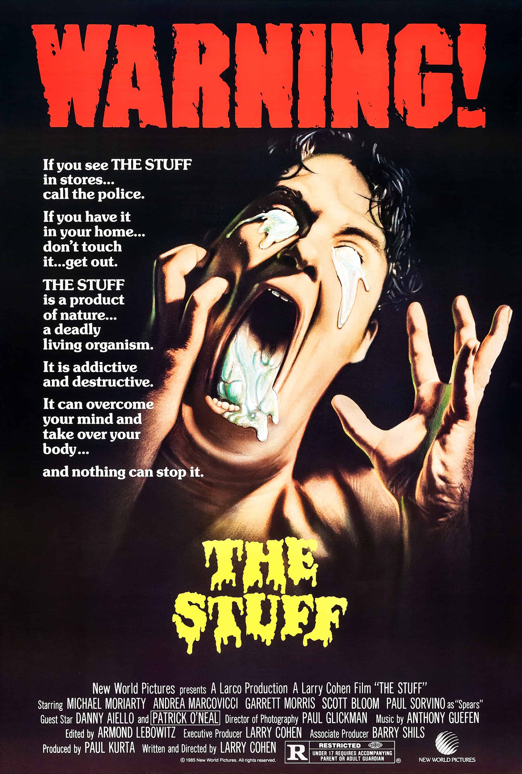
Cold War tensions would once again reach fever pitch during the 1980s, and though The Stuff is very much a loving throwback to simpler times, its sentiments very much belong to the 80s, criticising the commercial and production malpractices of a global world, a commentary beautifully captured by the film’s famous tagline, “Are you eating it, or is it eating you?”
Stripped of Cold War parody, the poster’s featured image is a vivid triumph of warped horror, hinting at the kind of flesh-melting antics that genre fans invariably clamoured for in an era of practical effects indulgence. It also takes a distinctly ironic monster and transforms it into something that inspires true terror.
It certainly scared the shit out of me.
Poltergeist (1982)
As home video grew in popularity during the 1980s, horror movies explored the idea of television as an irony-laden gateway, a literal portal to the fear they were purveying.
David Cronenberg would utilise the concept in a more salacious way for his 1983 classic Videodrome, less relevant shockers such as Demons 2 and Pulse also jumping on the meta bandwagon, but of all the movies to use television as a conduit for otherworldly malevolence, Tobe Hooper’s Poltergeist is perhaps the most memorable.

Poltergeist‘s promotional poster is a devastating example of promotional simplicity; a rare case of less meaning infinitely more. The composition of the piece is key to its blank potency. At its centre, highlighted by an all-encompassing blackness, is the movie’s peewee protagonist, her bright isolation demanding closer inspection. Carol Anne Freeling’s static intimacy with an inanimate object proves spellbinding, providing a beautiful representation of one of horror’s most iconic scenes.
Poltergeist would establish itself as one of the most memorable horror pictures of the decade, and this wonderful accompaniment is no different. A visual concept that is not only worthy of the movie’s success, but is in no small part responsible for it.
Street Trash (1987)
Street Trash is a wonderful, Troma-esque horror flick whose ingenious low-budget special effects astound as much as its absurdity of a plot. After a peculiar brand of liquor labelled Viper mysteriously appears in the basement of a local shopkeeper, the unscrupulous chap decides to flog it to the local homeless community with outlandishly messy consequences.
The movie follows the lives of two hobos as they struggle to deal with the worsening effects of the fatal brew, all while staving off the threat of sociopathic Vietnam veteran Bronson, the owner of the junkyard that they frequent.

Street Trash is another movie in the body horror vein — a zany, often ponderous story that works on a purely visual level. The poster encapsulates this with a grotesque accuracy that is truly spellbinding.
The extravagantly coloured piece depicts the film’s most notable and ironic death, its warped perspective leaping off the canvas like a grandiose work of street graffiti. It is a quite remarkable representation of not only the movie’s themes, but the misshapen, mind-bending style of what is a true oddity, with a punk aesthetic that speaks to the film’s anarchic tone.
Street Trash will never top the list of the genre’s best movies, however unique its content, but the same cannot be said about one of the most mesmerising works of promotional art of a decade that was rife with them.


Nice picks. Always really liked the Friday the 13th poster, but never really thought about how good it actually is, nice analysis there. I think Sleepaway Camp has a similar, intriguing and self-explanatory poster.
Have you ever seen the Japanese Nightmare on Elm Street poster? It’s… Fantastically bizarre. http://imgur.com/a/ukNUU
LikeLike
That Japanese poster: I’m speechless. Whoever designed it needs a crash course in subtlety. Ha. It’s kind of cool though. Their posters are often interesting. Some are wonderful. I love this one for The Fog: http://66.media.tumblr.com/096a82e29c2709c4271b09781eb3374d/tumblr_mgqaaoDpMN1qh35m6o1_1280.jpg
and this for Dead Alive aka Braindead: https://s-media-cache-ak0.pinimg.com/originals/82/31/8b/82318b5f1d3b58bd4b164c452f15723b.jpg
Incidentally, they are both scheduled to appear in subsequent parts of my site’s posters feature so I’ve kind of ruined it for you if you plan on reading. Oh well!
p.s. If you have an idea for a feature of your own you are more than welcome to contribute to VHS Revival. Just private message me through Twitter with a pitch.
LikeLike
Ha, both of those are great, especially the one for Dead Alive. As often as western horror fans have probably been duped by an extravagant and misleading poster or video/DVD case, imagine growing up with those Japanese videos.
Definitely looking forward to any future entries about posters or covers, they’re always a great little nostalgia trip. Especially if it’s bizarre and over the top stuff. If I think of an interesting feature idea I’ll definitely let you know.
LikeLike
I love these posters. Creepshow 2 has a great poster. I’ve always loved it and the Fright Night poster is very clever and spooky. It scared the crap out of me when I was a kid! I love the Nightmare on Elm Street poster with Freddy’s iconic glove as it is just menacing and the Friday the 13th one is great and I am a huge fan of the original movie even though there is no Jason!!! Great post!
LikeLike
Thanks, Amanda.
They’re all great posters – some if the finest of the decade. There are so many great posters from that period, many of them much better than the movies they advertised. It was just an oversaturated market, particularly during the slasher boom, that these promo posters really meant something. With so many movies of the same nature during the VHS era, they were essential in allowing them to stand out.
Thanks for reading!
LikeLike
Love this post. I always thought Creepshow 2 was a better movie than the first one.
LikeLike
Totally. Particularly The Raft. Even if the jump scare ending can’t hold a torch to Stephen King’s open-ended short. Charmingly cheap!
LikeLike
It’s a much better movie than the first, which I never really bought into at all. The raft was particularly enjoyable. You should read the Stephen King short of the same title if you can find it. It had a less cinematic, but infinitely scarier ending.
Excruciating!
Much like the acting in the first of Creepshow 2’s segments, ‘Old Chief Wooden Head’.
LikeLike
The art of creating movie posters is indeed a lost art. Today it’s usually a profile, or glamor shot, of the star(s) of the film, no originality, or imagination in it’s illustration. Sadly, the same can be said for album jackets, and even the sleeves, that once adorned vinyl records.
LikeLike
I agree. Funkadelic/Parliament had some wonderfully zany album sleeves. They created an entire universe, just like their music.
LikeLike