

VHS Revival tackles its trickiest franchise ranking to date
Michael Myers. Of all the characters forged during horror’s long and unyielding legacy, few are as enduring as the indomitable ‘shape’, a relentless force of stalk-and-slash commercialism who has terrorised teenagers for six decades.
It’s been quite the ride for Michael, with blood-soaked sequels, alternate timelines and contentious reboots sparking all kinds of disputes among fans of John Carpenter’s most infamous creation. Ranking the series was quite the proposition, but even tougher is the prospect of ranking the iconic promotional posters attached to it.
VHS Revival attempts to do just that…
11. Halloween II (2009)
Rob Zombie would quickly add a sequel to his largely reviled 2007 Halloween reboot, and the majority of fans were not best pleased. With Laurie now a high school slut and Dr Loomis a money-grabbing circus master looking to exploit his most famous patient, things were set to get a damn sight worse (though some view the movie as an underrated gem, so don’t give up on it completely). Michael’s canine-devouring survivalist would set off on yet another killing spree in Zombie’s grungy follow-up, a series of mostly random victims meeting a rather gruesome end.
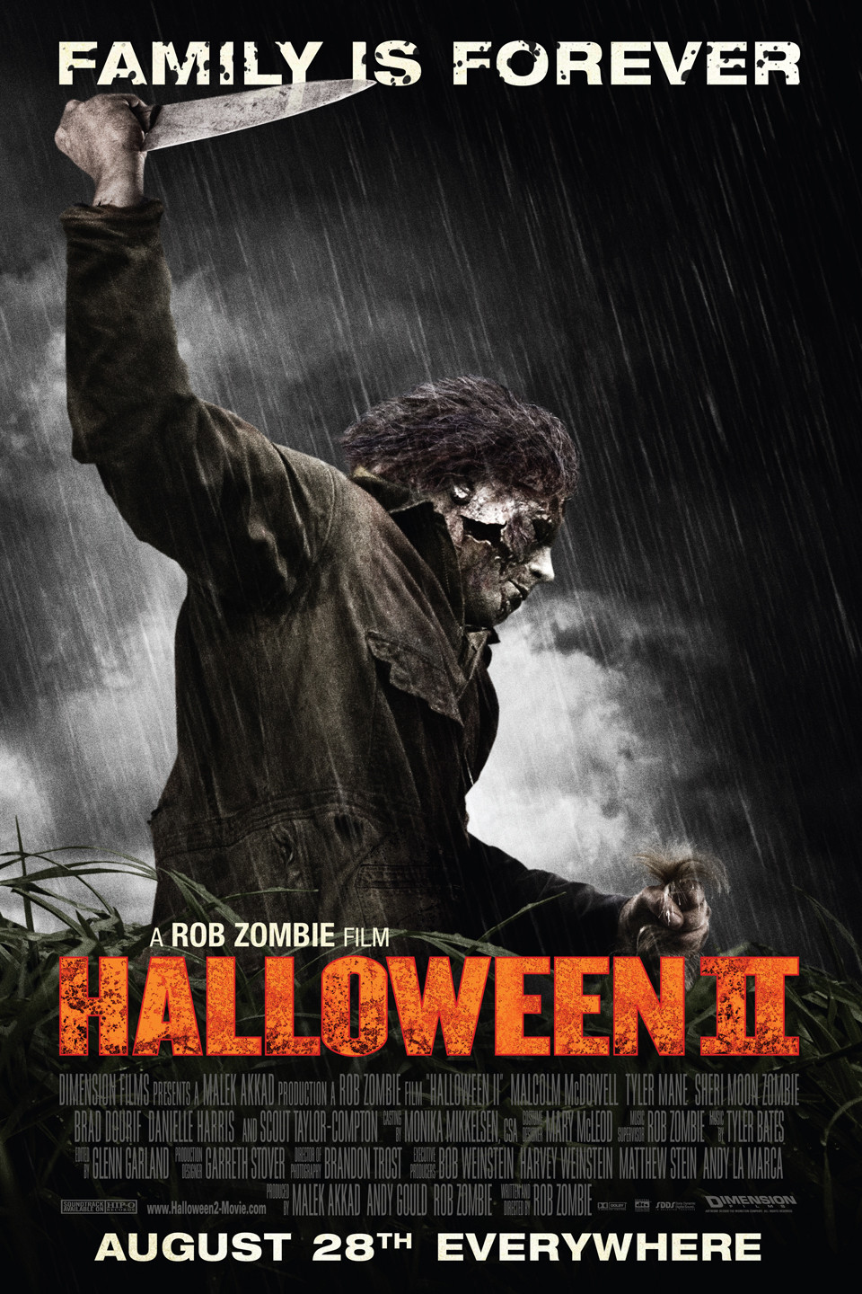
Whatever your opinion of the movie, its accompanying poster captures Michael’s ugly tenth outing fairly admirably. In a movie that offers very little restraint, a savage, distinctly 21st century Michael is front and centre, grabbing an anonymous victim’s hair in a manner that unashamedly lays out both the character and the film’s intentions, as do the poster’s blazing titles, which scream out against a gloomy palette of ominous destruction. On the negative side, it lacks any real compositional innovation, and aesthetically it all looks kind of cheap.
10. Halloween Resurrection (2002)
Is 2002’s Halloween Resurrection the very worst of the series? Other instalments have taken more liberties, some were more nonsensical, but for sheer, bloodless boredom it takes some beating. It doesn’t help that the whole reality TV angle and the equipment used to capture it dated so horribly so quickly. Add to this a completely forgettable cast and the addition of a kung-fu fighting Buster Rhymes and you’re in for one hell of an underwhelming ride.

The poster for Halloween Resurrection, the product of some early, post-millennium photoshopping, is also a tad dated compared to some of the more modern efforts, as well as the canvas art that preceded it. It has that Dimension Films Scream vibe, which was also somewhat dated by 2002, the movie coming at the butt end of the self-aware slasher revival. The anorexic silver titles are pretty uninspired, as is the cast-reflected-in-a-knife composition. Michael is almost peripheral here, too, an indicator of the film’s celebrity oriented banality. A relatively average effort redolent of the sub-genre’s increasing staleness.
9. Halloween: H20 (1998)
Friday the 13th series alumni Steve Miner’s admirable effort at reviving the moribund Halloween franchise for the post-Scream 90s ultimately lacked identity. Halloween: H20, a direct continuation of the events of 1978, felt like anything but, the red-hot Kevin Williamson’s involvement, particularly as an uncredited writer, plunging the film very much into Ghostface territory. The film was touted as the saviour of a series that had lost its way, but despite its slick production and more than competent direction, a movie that “began with the best intentions” turned into a “money gig”, ditching the Myers mystique for Scream‘s commercial savvy.
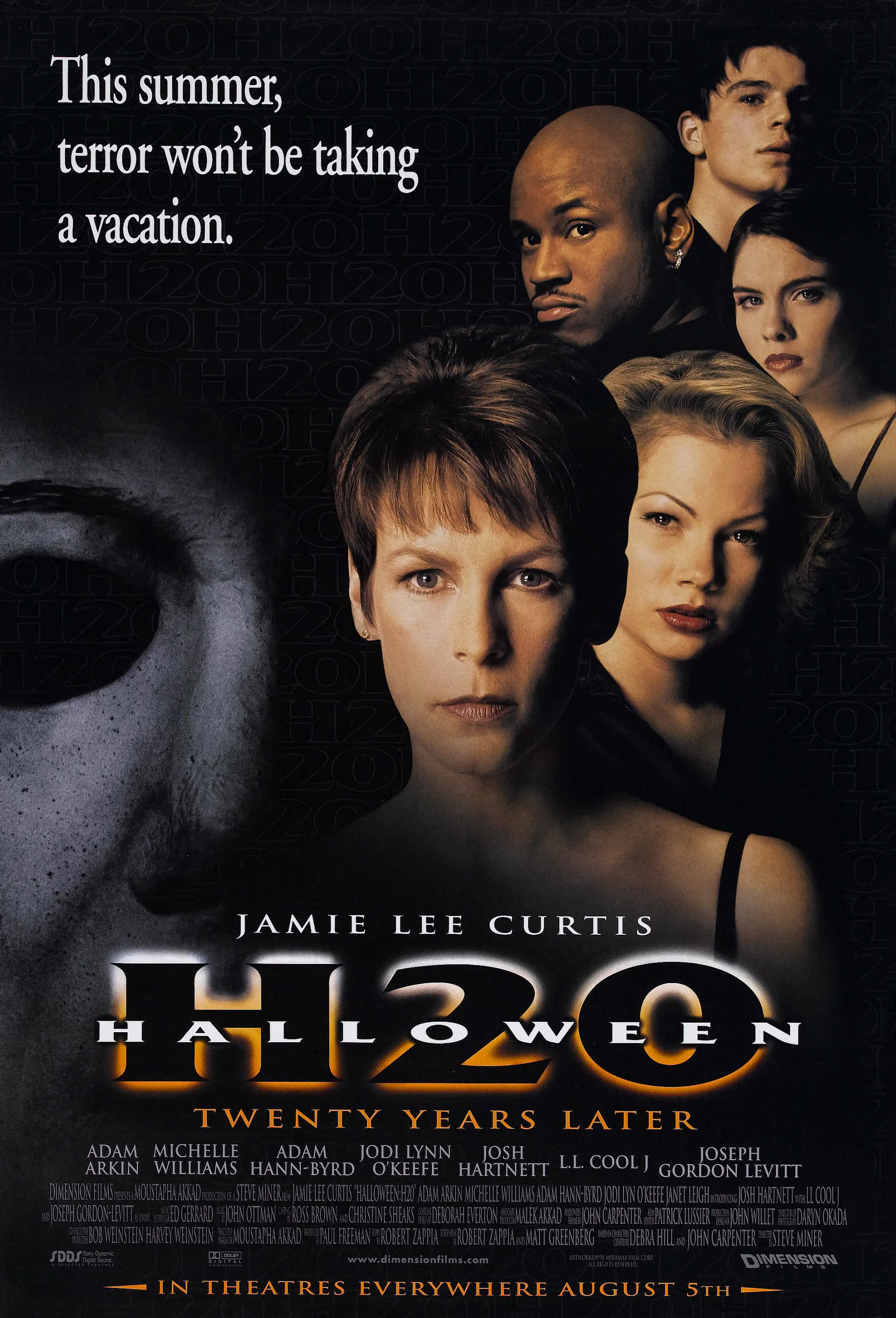
H20’s poster is similarly astute from a commercial perspective, a marked upgrade on Halloween Resurrection‘s almost carbon copy four years later. With the Dimension Films revolution still fresh, the poster’s composition was very much state of the art in 1998. The title’s are also rather eye-catching. Composition-wise, Michael again assumes second billing to our all-star cast, though the use of his image is rather ominous, dissolving out of the dark in a manner befitting of the character’s mystique. A solid effort that is very much emblematic of its time, but in an era of oversaturation, there are just too many posters like it.
8. Halloween III: Season of the Witch (1982)
The only Halloween instalment to not feature the iconic shape is by no means the worst in the series. After Carpenter seemingly closed the book on Myers, still reeling after conceding to the gore-laden Halloween II, the idea of an annual film under the guise of the Halloween brand was proposed. Each movie would feature a different story and cast of characters, but a lacklustre response to 1982’s Halloween III: Season of the Witch, a charming tale of killer androids and sinister Halloween masks that turn kids into piles of insects, saw the concept shelved. It’s fascinating to think how it might have turned out given the chance.
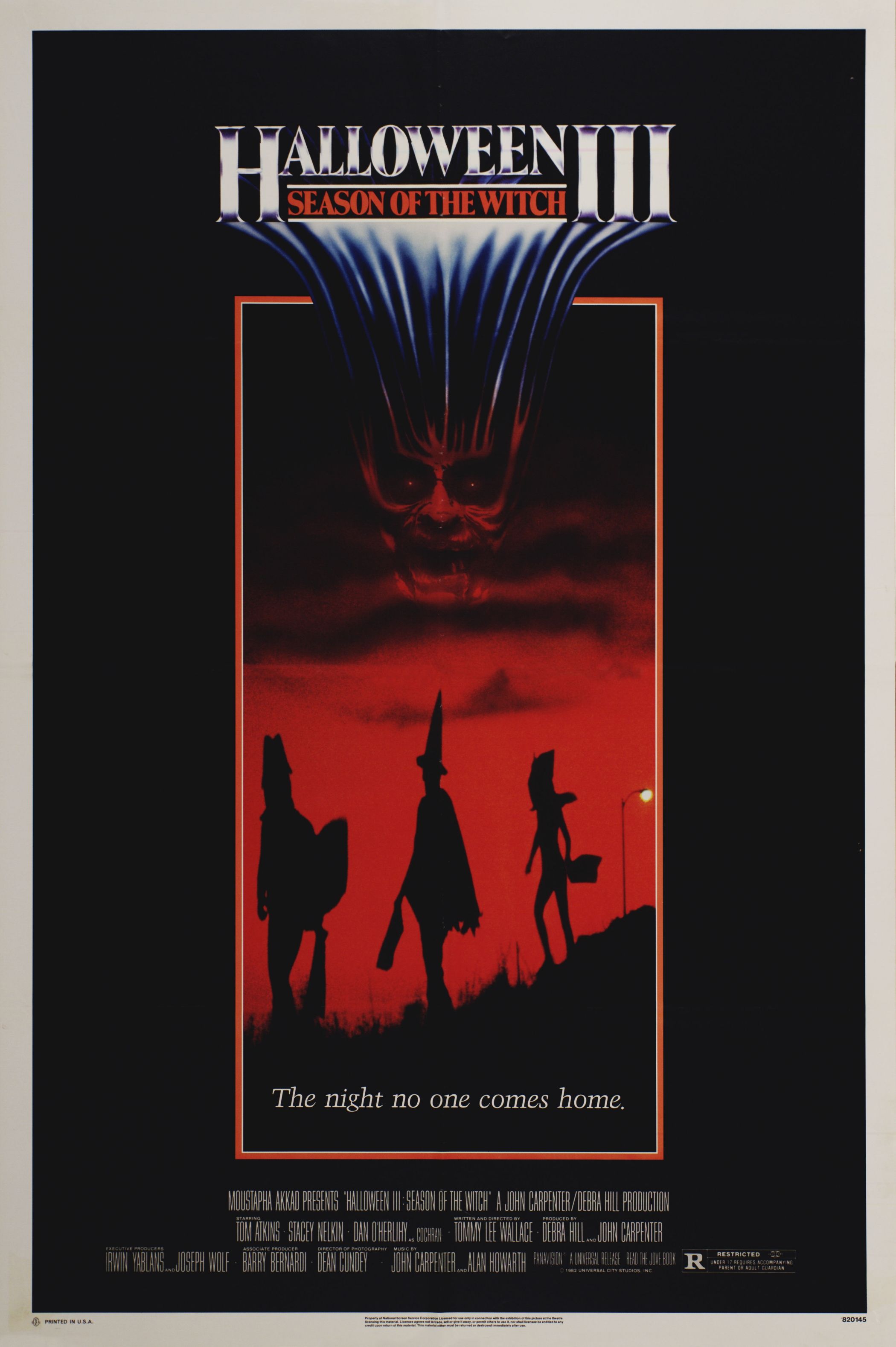
Thanks to a wonderful dystopian soundtrack, some genuinely creepy villains and an insidious jingle for the ages, Halloween III: Season of the Witch has achieved cult status in horror circles. Just like the above poster, it manages to capture the spirit of Halloween and the malevolence lurking beneath festive traditions. In-keeping with the film’s changing theme, the classic Halloween text is replaced by a metallic variation redolent of the film’s sci-fi twist. The poster focuses more on the tale’s doomed mini suburbanites, their fancy dress silhouettes cast against an eerie, blood-red sky. Something of an anomaly, much like the film itself, but a memorable entry nonetheless.
7. Halloween: The Curse of Michael Myers (1995)
Subjected to a series of reshoots following negative reactions from test audiences, the series-halting sixth entry in the Halloween series is quite the curio. Different cuts of the film were ultimately released, including the long-fabled Producer’s Cut, which features an extended finale and clears up much of the storyline confusion evident in the theatrical release, focusing more on the whole Cult of Thorn lore. It would also mark the the final appearance of series stalwart Donald Pleasence, who would pass away almost eight months prior to the film’s eventual release. Halloween: The Curse of Michael Myers may be downright incomprehensible at times, but I must admit, I rather enjoy the silliness of it all.

Being 13 at the time, Halloween: The Curse of Michael Myers was the first instalment I was able to anticipate the release of, and the promotional poster was rather tantalising. All these years later, I still like it a fair deal, and not just for nostalgia reasons. It keeps things fairly simple, retaining the iconic Halloween text that would disappear towards the end of the decade, the contrast of stark orange and icy blue proving striking to say the least. Michael and his favourite implement are the main attraction here, emerging from the darkness in a way that is both subtle and prominent. All-in-all, a poster of fetching simplicity that shines thanks to its fantastic use of colour.
6. Halloween (2018)
After the convoluted backstories and extreme violence of Rob Zombie’s reboots, it was time to get back to basics, and, a ludicrous Loomis protégé notwithstanding, 2018’s Halloween did just that. Ignoring the plethora of sequels that would humanise and even sympathise with a character who is best described as pure and simply evil, the film was instead a direct sequel to Carpenter’s 1978 original, pitting Michael against a battle-hardened Laurie living in fear of his return.

The film’s accompanying poster lays out those intentions bare, and does a beautiful job of it. The striking black and white colour scheme and simple composition immediately strips away the weeds of convolution accumulated throughout the decades, a long-incarcerated Myers leaning wearily in from the darkness. Laurie isn’t the only one who has aged in the forty years since the original Haddonfield massacre, and Michael’s well-worn mask displays the creases of a subdued figure with an unyielding purpose. To kill.
5. Halloween (2007)
Rob Zombie’s Halloween was not what many fans of the franchise were looking for. The filmmaker’s violent and grungy style, already displayed in films such as 2003’s House of 1000 Corpses, was hardly befitting of a character of Michael’s lineage. Inevitable comparisons were made with the original Halloween (the shadow of Carpenter’s masterpiece still looms large), and though Zombie undoubtedly achieved his goal in creating something different, his relentless quest to provide the character with a detailed backstory killed the Myers mystique, as did the film’s decision to pile on the gore before attempting to recreate Carpenter’s brooding Haddonfield massacre.
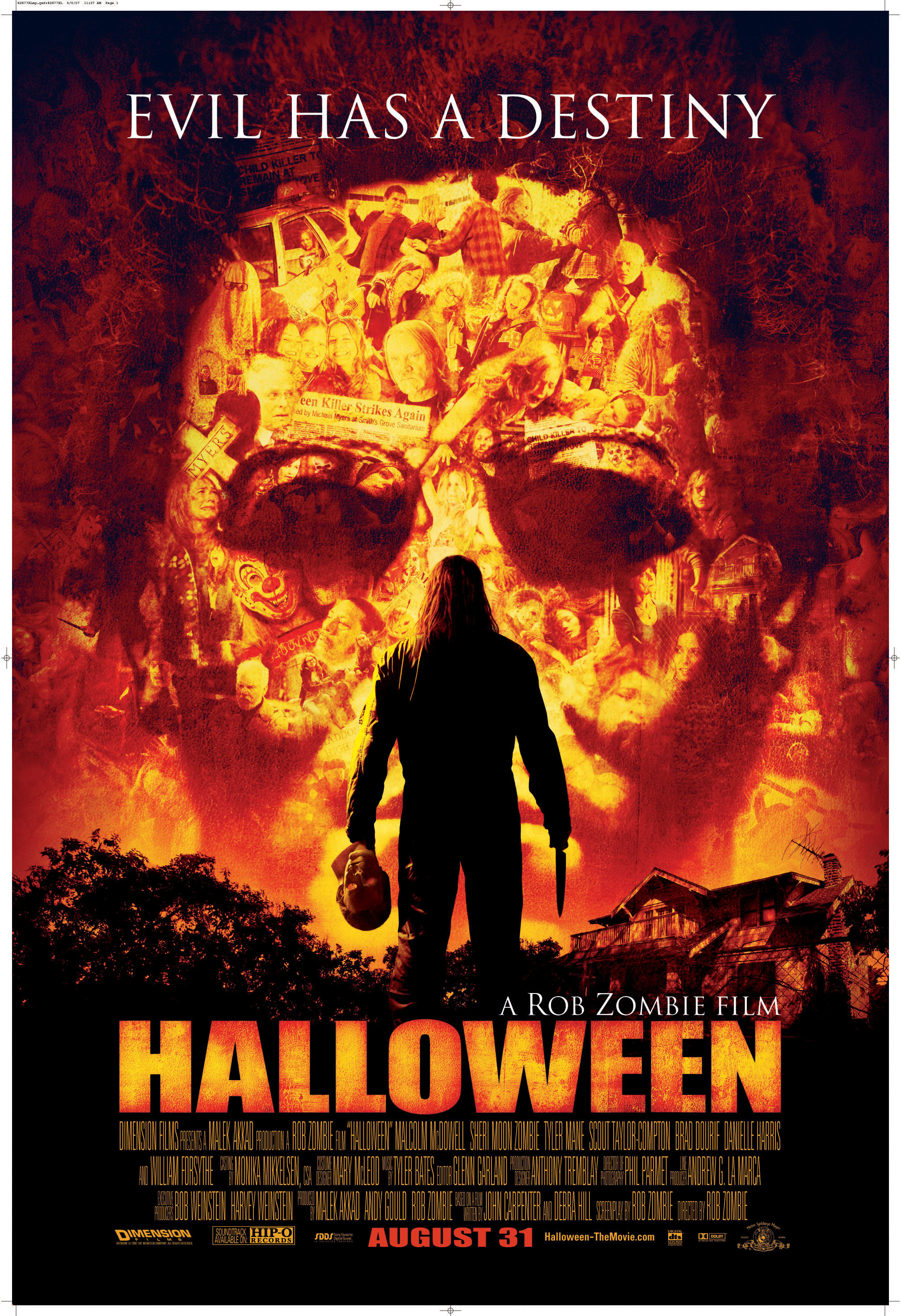
Whether you dig Zombie’s take on the material or not, there’s no denying the craft and ingenuity that went into designing its accompanying poster, a blazing collage of pent-up fury that hints at the character’s motivations and the combustible rage contained behind the iconic Myers mask. An unmasked Michael, staring ominously at both his past and future, also hints at Zombie’s revelatory approach to the character. It’s a truly stunning work that no doubt contributed to the film’s considerable box office success ($80,400,000 on a budget of just $15,000,000). It’s just a shame the action didn’t live up to the anticipation.
4. Halloween 5: The Revenge of Michael Myers (1989)
For many, Halloween 5: The Revenge of Michael Myers was the one where things got just a little bit silly. First of all, it gave us the whole Man in Black cliff-hanger that was never really fulfilled, especially in the ‘Halloween 6’ theatrical cut. It also ditched the whole Jamie-Lloyd-as-killer concept teased at the end of Halloween 4 in favour of a tacked-on and uneven telepathic angle. The film even attempted to humanise Michael, director Dominique Othenin-Girard’s desire to return to Carpenter and long-time collaborator Debra Hill’s Hitchcockian suspense template conflicting with the studio’s desire for a Voorhees-esque slaughterthon. Girard achieves what he set out to at times, but the movie damaged Michael’s integrity from a narrative perspective, there’s no getting away from it.
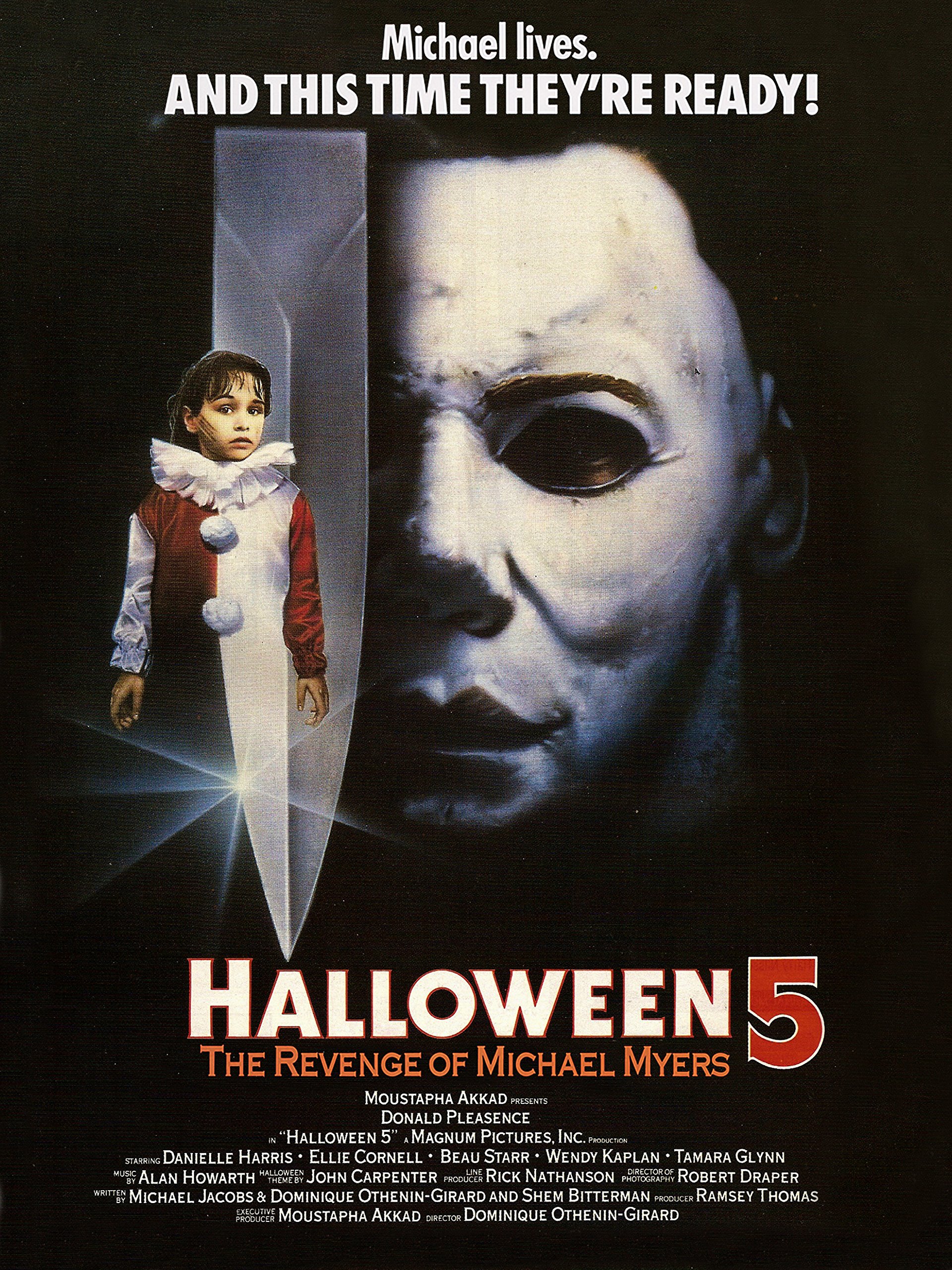
Then we have the poster for Halloween 5, which is just superb. I have something of a nostalgic connection to canvas art when it comes to movie posters. Modern posters are obviously without limitation thanks to evolving technology, but there’s something so pure about canvas art, something this particular poster captures and then some. In terms of pure technique it gives us a fantastic likeness of both Jamie and Michael, the latter’s emerging mask worthy of Carpenter’s original bogeyman. The composition is also interesting, symbolic of the telepathic connection the two share, though in terms of good vs evil they are split right down the middle (with a butcher’s knife no less). Simply unforgettable.
3. Halloween II (1981)
Despite resistance from Carpenter, the financially fruitful slasher genre, the very same the original Halloween had inspired but didn’t necessarily belong to in spirit, proved too much of a temptation for all involved. With the likes of Friday the 13th enjoying mega box office returns off the back of low risk ventures, Myers would be dredged from the realms of open-ended uncertainty for a more definitive and less frightening resolution, an emphasis on gore meeting commercial trends in a way that went against Carpenter’s Hitchcockian suspense template. Even with cinematographer Dean Cundey back on board, Halloween II, which picks up exactly where the original left off, proved something of a disappointment. It came closer than any other instalment in capturing the original Halloween vibe, but some things cannot be recreated.
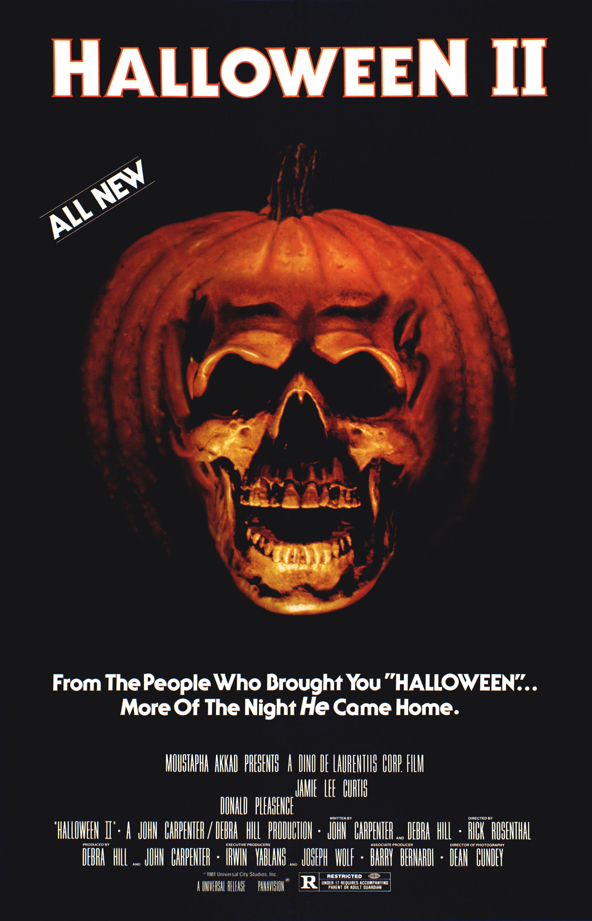
Halloween II was a much nastier outing, and the film’s accompanying poster is certainly representative of that. The moody, skull/pumpkin hybrid that dominates the composition, glowing ominously in the darkness, is an inspired image that is absolutely alive with evil. It is also the only poster from the franchise (barring spin-off Season of the Witch), that does not feature Myers in any form. It’s a simple concept, simply executed, but simplicity is very often key, and if the main purpose of a horror poster is to terrify, this one does a spectacular job of it.
2. Halloween 4: The Return of Michael Myers (1988)
Here’s another poster that absolutely stirs the nostalgia juices. By the turn of the 90s, I was already an unhealthy horror fanatic, and this image is one of my abiding memories of trawling the dusty cave of wonders that was my local video shop. At the time, I was pretty much obsessed with stalk-and-slash killers, particularly Michael, Freddy and Jason, and Halloween 4 is arguably the most generic slasher of Michael’s tenure, the series returning after a six-year hiatus with Friday the 13th aspirations. I’m not a huge fan of the movie today. It’s all a little bloodless and imitative of Michael’s biggest imitator, but I absolutely loved it at the time, and still retain something of a soft spot. Plus, there is THAT ending to consider.

The poster is another canvas art triumph. The composition doesn’t quite match that of Halloween 5. Michael is perhaps a little overwhelming in terms of space, but if you’re looking to announce the long-awaited return of a lost icon, then I suppose it makes sense. It is also symbolic of the character’s omnipotence over Haddonfield’s otherwise peaceful suburbia. Michael is a colossal presence with an almost supernatural ability to remain undetected, and this image totally captures that. In terms of form, it’s absolutely flawless, and the inclusion of the classic Halloween text always adds that touch of authenticity. For your information, I have this one framed on my wall. And there it will remain.
1. Halloween (1978)
Though a much closer call than I imagined, it would be plain wrong to not place the original Halloween poster at the top of this list. Not only is it representative of the finest film in the series, and one of the greatest horror movies ever conceived, it is also one of the most iconic posters the genre has ever known, and was particularly striking back in 1978 as supernatural horror gave way to much more familiar threats. There’s not much I can say about Carpenter’s low-budget miracle that hasn’t already been said, but the director’s use of space and shadows, one of the most memorable themes there ever was and a fortuitously iconic pallor forged from a William Shatner mask with the eyes cut out, resulted in one of horror’s true giants.

Naturally, this was the first poster to feature that iconic Halloween text. The jagged, glowing-eyes jack-o’-lantern, side-by-side with Michael’s taut, knife-wielding fist, is instantly recognisable, a horror artefact of the highest order. The image is simple, yet striking; like the character it represents, it lives in the darkness. There are some posters on the list that rival the original for technique and composition, but very few achieve this kind of iconic stature. The film’s classic status has more than a hand in the poster’s lofty position, but Halloween is a near flawless production, right down to its world renown promotional image, a timeless monument to the night HE came home.


Brilliant piece. I,however, only have the original films poster on my wall and framed. I do have all the quads and the others including the full length 8 foot vertical poster of Zombies Halloween II. But thanks for writing this, it’s made my day.
LikeLike
Thanks, Carl.
It’s absolutely my pleasure. Always great to discover fellow horror movie poster fans. I also have the original Halloween poster, but regrettably that’s it asides from 4. Sounds like you have quite the collection. I’d be interested to know what else you have.
LikeLiked by 1 person
I agree with #1(I usually favor simplicity:-) and I also dig the poster art for “Halloween 4: The Return of Michael Myers” (to me, sort of a remake of the first film, with more gore; it was the first “Halloween” film I recorded for myself–HBO). I also really like the poster art for “Halloween III: Season of the Witch”, which (which witch?) has always given me the goosebumps (I feel the same way about the montage of the trick or treaters in that film). For me, the third Halloween film counts, but counts differently in evaluating these posters. I suppose all the posters do their job, but I quit the series after part 4 (I did view & record the Zombie films, which I think are alright) until H20 ended the drought.
LikeLike
Yeah, the series lost the plot there for a good while, and though I appreciate the craftsmanship I wasn’t a fan of H20. It has that glossy Dimension Films feel that’s too close to Scream. I understand the slasher had evolved to meet commercial trends but it felt too imitative for a character of Michael’s heritage.
As for the poster… well, it’s a very different story. On the whole they’re just exceptional, particularly 1-5, and I’ve always been a huge fan of the poster for Rob Zombie’s Halloween, even if the movie proved a deadening experience for me personally.
I’m planning Best Posters rankings for Friday the 13th and A Nightmare On Elm Street in the near future so keep your eyes peeled. Again, lots of outstanding posters to choose from.
LikeLiked by 1 person
I have to admit to not liking H20 as much as I did back when it was fresher, but I never did key into its “Scream”/”I Know What You Did Last Summer” qualities; since you pointed that out, I totally see what you mean. I don’t believe that aspect of the film goes into the plus column, but unlike entry #’s 5 & 6 at least I find the whole thing coherent (Celtic curses? Cults? What’s going on here?! Weren’t Druids in “Spaceballs”? It was better there:-).
Funny thing, I discovered on YouTube yesterday that Halloween 4 was uploaded and has been available for a couple of weeks on there (I except it to be removed any time now). The point after that film is definitely where the Michael Myers train got carried away.
Oooh…lots of good posters for both of those franchises, and for someone who once had “A Nightmare on Elm Street” and the Dream Warriors posters as PC desktop art, I’m all for this near future you speak of!
LikeLike