

The Friday the 13th series arrived during an era of wonderful promotional posters. VHS Revival brings you its definitive ranking
13. Friday the 13th Part V: A New Beginning (1985)
To suggest that the fifth instalment of the Friday the 13th series was poorly received would be a colossal understatement. Released a year after Paramount’s fallacious series-ending proclamation, the franchise was dredged from the murky waters of Camp Crystal Lake before it even had time to sink to the bottom. In fact, Friday the 13th Part V: A New Beginning didn’t take place at Crystal Lake at all, instead relocating affairs to the Pinewood Home for Delinquents, and that was the least of its deviations.
Since Jason had been (temporarily) laid to rest in Friday the 13th Part IV: The Final Chapter, the character was instead replaced by impostor killer Roy Burns, the idea being that former Voorhees foe, Tommy Jarvis, would take over the homicidal reins going forward. But fans felt cheated by Paramount’s commercial slight of hand, the absence of Jason proving nothing short of heresy. It was the beginning of the end for the series as a true commercial giant.
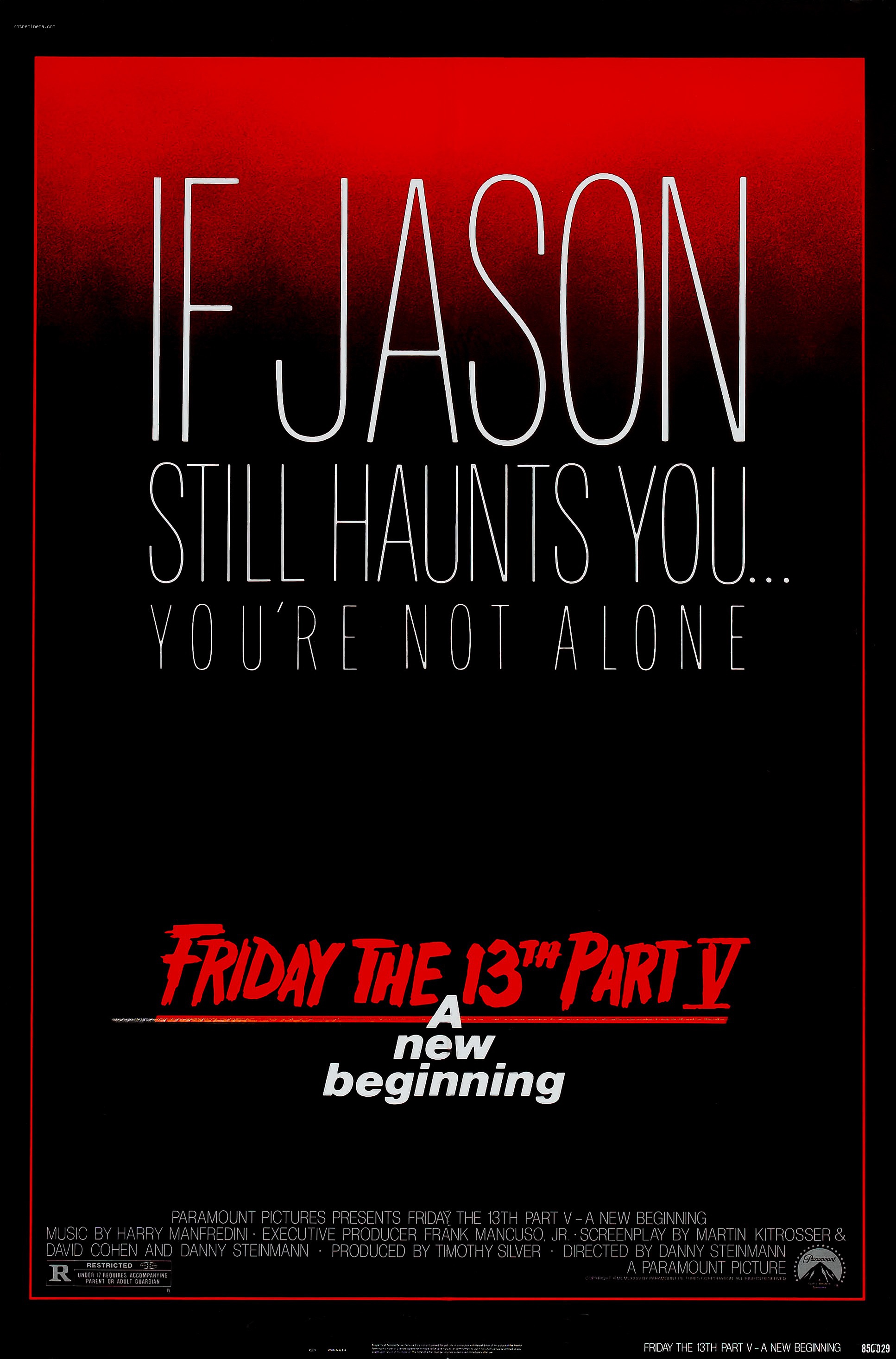
This may shock you, but I’ve come to appreciate A New Beginning for its silly extravagances. Despite feeling initially betrayed, it’s really grown on me, playing out like a goofy Scooby Doo Mystery. I can’t say the same for the poster, which strikes me as pretty bland in hindsight, much blander than the wonderful Spanish version, which features both Jason’s iconic hockey mask and a machete-wielding Jarvis in what is a truly ominous composition. Why Paramount chose to use this one on US shores is anyone’s guess.
I’m loving the colour scheme, and I understand there’s supposed to be an element of mystery here in a narrative sense, but in an era of eye-catching canvas art a little imagery would have gone a long way. We get the iconic Friday the 13th text, but the presentation of the movie’s tag line leaves much to the imagination, and not in a good way. It’s by no means awful, but for me the least memorable of a brilliant bunch.
Friday the 13th (2009)
There’s nothing particularly wrong with this poster; in terms of what it sets out to achieve, it does a pretty admirable job. It had been six years since Jason battled long-time commercial adversary Fred Krueger, the money-spinning Freddy vs Jason, a concept first pitched way back in 1987, becoming the highest-grossing movie in both franchises to date.
In an era of ceaseless horror reboots, it was only inevitable that both characters would make their (not-so) triumphant returns. 2010’s A Nightmare on Elm Street, though featuring a fine performance from Jackie Earl Haley as Krueger, was wracked with script problems. It also leaned a little too heavily on the character’s implied paedophilia, the escapist, supernatural mystique of the original character taking something of a backseat despite some lazily rehashed CGI set-pieces.

Though hardly revolutionary, the Friday the 13th reboot fared a little better, Jason returning as a brutal survivalist in the Friday the 13th Part II mode. The poster does a fine job of foreshadowing such a return, Jason’s indomitable form standing tall amid the wilderness, his black-eyed mask and machete-wielding stance fair warning to the legions of vacuous teens facing the character’s once-annual chop. Cleverly, it also uses the triangular composition synonymous with religious renaissance paintings, presenting Jason as an indomitable Christ figure. The artist certainly did his homework.
The reason why the above poster ranks so low is that, coming in an era of slick Photoshop technology, it doesn’t really feel like a Friday the 13th poster barring the appearance of Jason. Call me a traditionalist, but its broader style could belong to any horror franchise of the early 21st century. Though I understand this is an updated poster for a modern generation, something closer to the original Friday the 13th text would have been nice too. Not without its commercial logic, but certainly lacking in charm.
11. Jason Goes to Hell: The Final Friday (1993)
Where did it all go wrong for the Friday the 13th franchise? Since it put the series on the shelf for a whole decade, you’d be forgiven for citing New Line Cinema’s first punt at Jason-led brutality after buying the rights off Paramount with a view to finally making Freddy vs Jason a realisation. In reality, the series had been stumbling through the forests of creative expiration for years, nasal-gazing executives and the Motion Picture Association of American pushing Jason towards extinction despite the low-risk financial rewards.
24-year-old film school rookie Adam Marcus at least had the right intentions with Jason Goes to Hell: The Final Friday, but it proved a step in the wrong direction for fans of the series. Taking half a leaf out of A New Beginning‘s book, the film neglects to feature Jason for the most part, engaging in a body-swapping plot involving a worm-like manifestation of Jason’s soul that’s passed from victim to victim. The film was a wild deviation conceptually, with cute genre nods, horror ‘Easter eggs’ and a relentless whirlwind of action. In hindsight, there’s some goofy fun to be had, but moviegoers just weren’t buying it. Marcus would shoulder much of the blame, but what did fans expect? New Line had given him an almost impossible task.
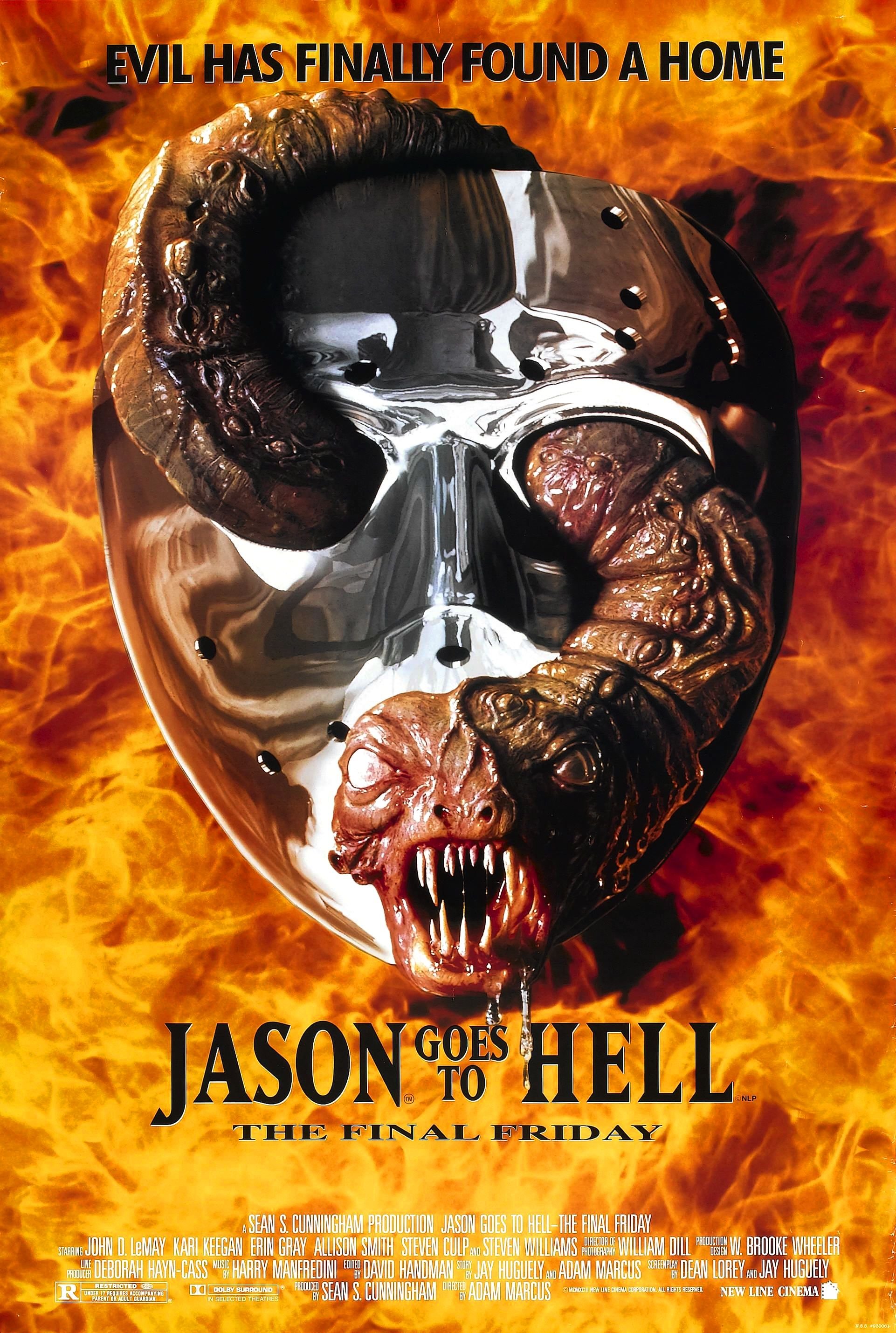
The above poster is just as startling aesthetically. With its primitive Photoshop presentation and in-your-face abandon, it couldn’t belong to any decade other than the 90s, a time when it was much more impressive. Today it leaves something to be desired. It’s less an image you can observe with quiet awe, more a visual assault that leaves you ducking for cover. As a representation of an unapologetic assault on series convention, it more than makes sense. As a pure visual indulgence, it’s a bit of an eyesore.
Remove the headache-inducing flames and it has its charms. This is the first movie to do away with the iconic Friday the 13th text, but Jason Goes to Hell does a fairly good job of updating it. The chrome mask is a bit of a head-scratcher, as well as a little cheap-looking, but the sight of Hellbaby worming its way through is a classic image presented rather admirably. All in all, a fair effort for the time, but unlike some of the canvas art that preceded it, it hasn’t aged too well.
10. Freddy vs Jason (2003)
Another poster that harbours a degree of visual antiquity is the one for Freddy vs Jason. I’m not referring to the composition, which is absolutely on the money, cutting straight to the main event for a movie that’s all about the long-awaited battle between two of horror’s biggest icons. The face-to-face showdown, separated by the movie’s title and embellished by the cute image of Freddy’s razor-fingered glove clashing with Jason’s machete, is as blatant and effective as a pre-fight ESPN sports package, but its problems lie elsewhere.
Freddy vs Jason the movie isn’t for everyone. In fact, it seems to divide opinion among fans of the franchise. It’s very much of its era, featuring some horribly dated CGI and suffering from something of a post-Scream, Dimension Films hangover, but the final showdown, pitting Freddy’s cunning against Jason’s brute strength, is handled quite brilliantly. The iconic Robert Englund, prancing and narrating like a carnival villain, is also worth the price of admission.

If this was 2003, the above image would have ranked much higher. As a commercial appetiser for a film that had wallowed in development hell for just shy of 15 years, it knocks the severed head out of the stratosphere, promising fans everything they’d hoped for with its dead-on composition and thematic transparency, but there’s something about Freddy and Jason themselves that seems just a little off.
It captures Krueger’s wicked flamboyance to some extent, but the decision to paint rather than photograph the character, something New Line Cinema would rectify for the VHS release, detracts from Robert Englund’s inimitable portrayal. Jason looks ever lamer. Too much of an emphasis on darkness, something else that was rectified for the VHS release, detracts from his iconic mask. And where’s the dead-eyed killer who terrorized Camp Crystal Lake for all those years? His eyes give off the doting warmth of a doe-eyed puppy. Exceptional at capturing the film’s concept, the aura of its characters not so much.
9. Jason X (2002)
Another poster that has fallen into the realms of Photoshop obsolescence, this 2002 poster for space-bound franchise anomaly Jason X, complete with interest-piquing tagline, is still something of an attention-grabber. Like Jason Goes to Hell before it, it’s absolutely in your face, but its celestial backdrop and muted colours make it much more palatable. I’m still ducking for cover, but this time its the all-consuming Jason, not a brain-sizzling explosion of flames, that leaves me cowering. The logo looks a little naff after all these years, but it’s not the overriding element.
The film itself is probably the most divisive in the entire series, and as far as I can make out the majority of fans are firmly in detractor territory. I like it. It’s as cheap as a Syfy Channel afternoon re-run but it totally gets Jason’s sillier incarnation. Presenting us with a cryogenically frozen beast reborn as an indestructible space-bound warrior dubbed Uber Jason, the film rips off sci-fi classics such as Alien, even featuring a welcome cameo from none other than filmmaker David Cronenberg, a sci-fi dabbler who Jason X director and special effects artist Jim Isaac had previously worked with.

In space, no one can hear you scream, and that’s certainly the impression one gets with the above poster, which presents us with an all-consuming killer who proves as omnipotent beyond Earth’s atmosphere as he did in the leafy recesses of rural America. Compositionally, it’s all rather clever, the image of a victim-reflecting knife delineating Jason’s Earth-bound form and the new and improved killing machine that not even the depths of outer space can halt.
Not classic Friday the 13th by any means, but for my money the cleverest and most effectively executed poster of the post-Paramount years. If you have a problem with that, I suggest you take it up with Uber Jason.
8. Friday the 13th Part 3 (3D) (1982)
My absolute favourite of all the Friday the 13th movies, but far from my favourite poster. Despite its pleasing aesthetics, clever tagline and, much like the film it represents, a welcome nod to Psycho‘s infamous shower scene, the promotional image for Friday the 13th Part 3 feels like something of a missed opportunity for a film that tapped into the Reagan 3-D era, promising a much more intimate experience with horror’s soon-to-be hockey mask-sporting franchise killer.
Despite proving something of a devolution in terms of serious horror, Friday the 13th Part 3, the second and last instalment to be directed by Halloween: H20‘s Steve Miner, was a film of firsts. It was the first 3-D film to receive a wide domestic release, the first to introduce a degree of silliness to the series, the first to bring Jason out of the POV shadows before the perquisite finale, beginning his transition from antagonist to protagonist, and, most crucially for the series going forward, the first to procure his legendary hockey mask.

The above poster does have something of a 3-D flourish, but it doesn’t exactly leap out at you, mostly due to a lack of colour (even that wooden logo leaves something to be desired). Rather fitting, since some of the movie’s 3-D effects were also a bit on the dodgy side. There were some breathtaking kills (the best in the series for my money) that utilised the notoriously tricky technology, but superfluous, drawn-out moments involving rakes, yo-yos and swinging bales of hay, shoehorned-in to get the absolute most out of the gimmick, proved incredibly silly (part of the reason why I love this particular instalment so much).
The poster for Friday the 13th Part 3 may lack the clever compositional flourishes of others from the series, but it’s still a memorable and iconic bit of imagery. It would also prove transitional for a character who evolved into a genre icon in the ensuing years. As well as providing many firsts, Friday the 13th Part 3 would be the last Jason-led instalment that didn’t prominently feature the character’s franchise-prolonging mask in the promotional material. Such an emblematic embellishment ensured that future posters, and the films they represented, would become a lot more colourful.
7. Friday the 13th Part 2 (1980)
A minimalistic riff on the original Friday the 13th poster, Friday the 13th Part 2‘s anonymous, outlined silhouette was a clever bit of commercialism. It was plainly obvious that Jason would adorn the role of franchise killer in mother Pamela’s absence, but the question of Jason’s appearance was just as intriguing. Asides from original final girl Alice Hardy’s dream, we’d not caught so much as a glimpse of the poor sucker who’d supposedly been left to drown all those years ago. How Jason had survived for so long in the wilderness undetected and why he hadn’t simply located his mother and put an end to so much retribution were certainly more pressing questions, but more than anything audiences wanted a look at Jason’s elusive kisser.
They’d have to wait, not just because of the tantalising nature of the poster, but because our killer, at least trying to raise some doubts, spent the majority of the film clinging to the POV shadows at a time when slashers were synonymous with the trope. He’d also spend much of the final act hidden beneath a peephole pillow case in a transparent rip-off of The Town that Dread Sundown‘s Phantom Killer. When he finally did emerge in the form of Warrington Gillette, not stuntman Steve Dash, who played Jason for the majority of the film, he was a walking deformity. Again, how? Why? There was never any mention of that in the first movie.

When you rush into sequel territory in the hope of establishing a franchise killer, plot holes are par for the course it seems, but Friday the 13th Part II is much more than a bad case of sequelitis. It has become something of an anomaly in the series all these years later, not only due to superficial elements like the peephole pillowcase, a horror artefact that would never be seen again, but because it presented Jason in a much more fragile form, pitting him against the most genuine and relatable final girl in the entire series in Amy Steel’s Ginny Field. There were no gimmicks, no instances of profound silliness, just dead-eyed slasher goodness prior to the numbered sequel explosion of later years.
The poster for Friday the 13th Part II is just as impressive, a similar outlier that does what A New Beginning would try and fail to do a half-decade later, concealing and teasing in a way that is also visually inspired. It is everything you want from an art form whose purpose is to get audiences into cinemas without giving too much away. A fitting tribute to arguably the purest post-Halloween slasher to come out of the Golden Age, and one of the purest and most enjoyable of the entire genre.
6. Friday the 13th Part VIII: Jason Takes Manhattan (1989)
My least favourite instalment of Friday the 13th’s original Paramount run actually hits it out of the park in terms of promotion (did it have any other choice all things considered?), but if you’re expecting to see Jason socking decapitation dingers out of New York’s world-famous Central Park, think again. With its subheading, Friday the 13th Part VIII boldly promises to go toe-to-toe with the world’s cultural epicentre, a promise it doesn’t come close to living up to.
I write as much for two reasons. The first comes down to an issue that had plagued the series for years before Jason Takes Manhattan‘s release: horror movie censorship. Thanks to protestations from critics and parents’ groups, the slasher, and the horror genre in general, experienced something of a tonal shift during the latter part of the 80s, the creative violence of the earlier part of the decade replaced by horror of the supernatural and self-aware variety. With such a brand name and major studio support, Jason Voorhees became the poster boy for such outrage, leading to some of the most edited-for-gore films of the decade.
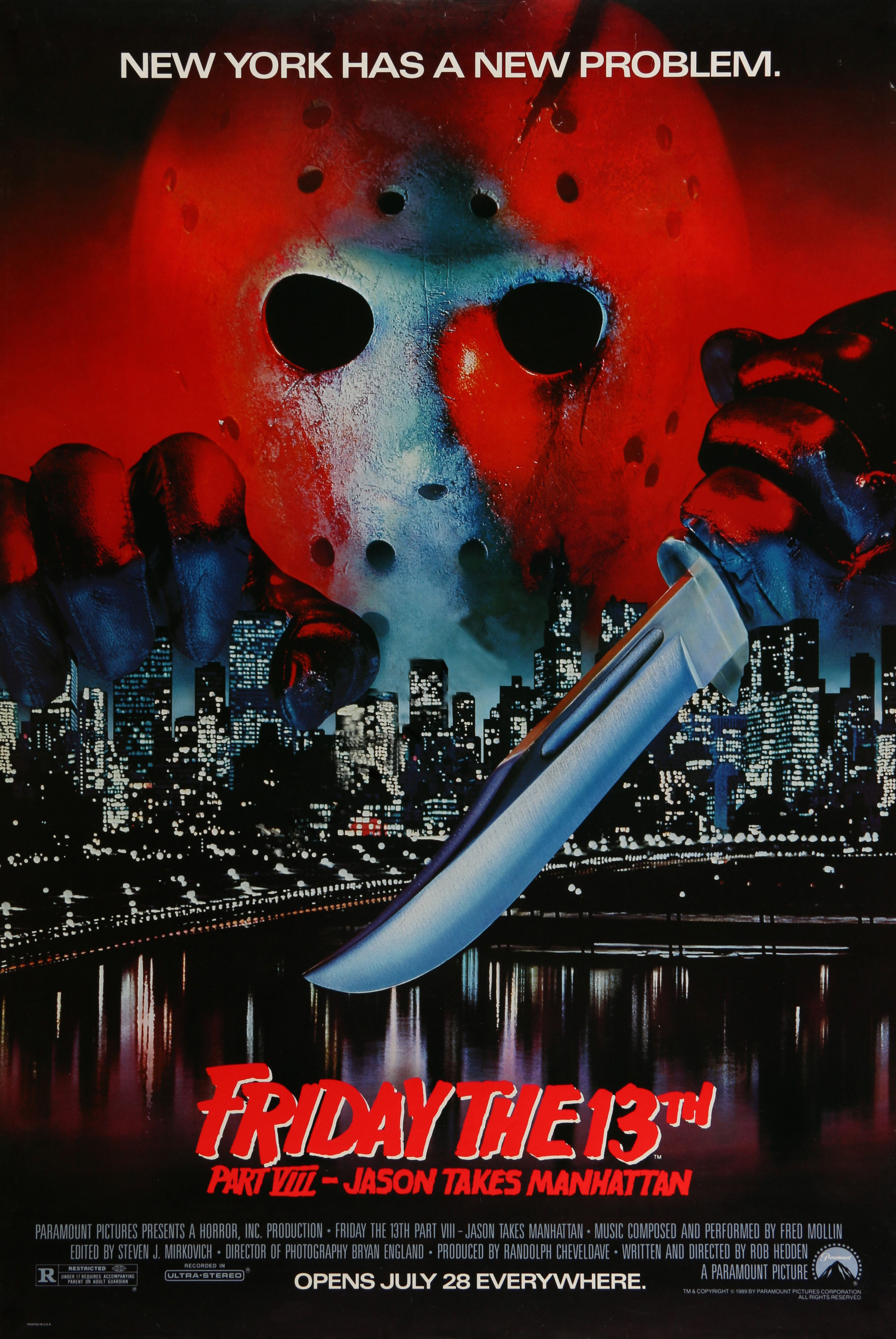
In that regard, Jason Takes Manhattan, Paramount’s final fling with a property that had given so much and asked for so little, was the absolute worst of the bunch, Jason captured with a censor-dodging fetishization that robbed us of creative violence and drained the film of even a morsel of suspense. The second reason was budget. The ludicrous fees involved with shooting in the City That Never Sleeps saw much of the proposed screenplay scrapped. Instead of boxing matches in Madison Square Garden and the sight of Jason leaping off the top of the Empire State Building, audiences were subjected to a long, laborious boat ride for much of the movie, the majority of those New York City scenes actually shot in Vancouver, Canada. It was an ignominious end for horror’s most prolific fictional killer.
In short, the poster delivers on what the movie promised, an image of an omnipotent Jason getting to grips with The Big Apple’s iconic skyline representative of a killer with destruction in his veins. The poster’s colour scheme is also reminiscent of late-80s MTV videos, successfully tapping into the teenage pop music crowd. A pop culture giant Jason may have been, but Jason Takes Manhattan toppled a character plagued by the kind of creative restrictions that no horror film should ever be subjected to.
5. Friday the 13th Part VIII: Jason Takes Manhattan – original version (1989)
You thought we were done with Paramount’s creative and commercial stinker? Not by a long shot! Arriving at the genre’s puritanical nadir in terms of censorship, the good folk at the The New York City Counsel and Boards Of Tourism also took umbrage with Jason Takes Manhattan, threatening to sue Paramount over the content of the film’s original promotional poster, a slightly bloodier variation of the one featured below. When Paramount reduced the blood, their detractors still weren’t happy, meaning the below image was scrapped entirely. Jason may be a ruthless killer of unrepentant proportions, but give the man a break!

As attractive and as fitting as the eventual Friday the 13th poster was, one that was ultimately embraced by fans, it doesn’t come close to the above poster in commercial terms. Not only does it capture the essence of one of the biggest tourist draws on the planet, it beautifully captures the self-reflexive meta humour of Jason’s later instalments. It’s a shame as the debacle that was Jason Takes Manhattan, a venture that convinced Paramount to ditch the property for good, posted the worst box office numbers of their run with a lowly $14,343,976. I’m not suggesting the series wasn’t already dead in the water, but such a witty visual draw would surely have been worth at least another million.
Ah, c’est la vie!
4. Friday the 13th Part IV: The Final Chapter (1984)
The below image is yet another example of striking minimalist promotion laying out the premise of a movie with matter-of-fact transparency, and once again it works a treat. The poster for Friday the 13th Part IV: The Final Chapter was the first to place an emphasis on Jason’s iconic hockey mask, ironic since it was originally meant to be the last instalment of the entire series.
Was Paramount’s ‘Final Chapter’ proclamation, as legendary critic Roger Ebert would publicly claim, merely a ruse to boost profits? As A New Beginning‘s emergence would prove less than a year later, they clearly had no intention of abandoning such a commercially stable franchise, but the whole Tommy Jarvis as killer set-up is enough to suggest that it was supposed to be the end for Jason. Director Joseph Zito and practical effects maestro Tom Savini were also convinced that The Final Chapter would be just that, stating as much in various interviews. They should have known better!

Thanks to its blend of cult actors, creative kills and Ted White’s frenetic and intimidating portrayal of Jason, Friday the 13th: The Final Chapter typically ranks high on franchise movie rankings, and, at least as far as this list is concerned, the accompanying poster is no different. The movie also features the supposed demise of the Jason character thanks to a memorable bit of practical effects artistry from Savini, who was chuffed to return to the series for the first time since the original, taking pride in the fact that he was able to both give birth to Jason, and, for all intents and purposes, lay him to rest in the most gruesome way imaginable.
Jason’s demise is central to the concept of this particular poster, advertising what we all knew was going to happen in no uncertain terms. Since the hockey mask had already grown iconic in Jason’s brief absence, the image of a knife impaling the artefact was a cute way to foreshadow the inevitable without giving too much away, also allowing the character an air of mystique for the last time in the series. After Jason’s post-A New Beginning meta rebirth, the character would become very much the focus in a way that was rather blatant, leaving behind the tension-building shadows for good. It’s a fitting accompaniment for the end of the character’s Golden Age.
3. Friday the 13th Part VI: Jason Lives (1986)
From the movie that signalled the death of Jason as a serious slasher villain to the one that reinvented him for the late 80s, the meta floodgates would open to blood rivers of self-aware humour in Tom McLoughlin’s deceptively clever fifth sequel. Jason Lives would transform Jason into a creative killing machine with irony spilling from his spurting arteries (and the plethora of other injuries picked up along the way), quite literally returning from beyond the grave thanks to a fortuitous blast of lightning that recalled Mary Shelley’s Frankenstein and set the character firmly on the road to Universal Monsters immortality.
Jason Lives still suffered from censorship impositions, but it more than made up for it with knowing humour and sheer playful energy. For many, the series was already dead and buried by 1986, and though some of those later instalments proved bloodless in more ways than one, Jason’s triumphant return to Camp Crystal Lake, renamed Forest Green in an attempt to bury the memory of America’s most infamous multiple killing spree, was openly and purposely ridiculous in way that would never be repeated. The kills were an utterly priceless return to form too. It’s a true diamond in the mid-80s rough.

What can I say about the above poster? It’s representative of everything I’ve just written and so much more. Jason’s mask is central to the composition without totally dominating thanks to his equally colossal tombstone, complete with the most ironic engraving I’ve ever seen. In Jason Lives, Mrs Voorhees’ unassailable baby boy came back with a bang. In the past he had been nigh-on invincible. Here his unconquerable nature is quite literally set in stone. Kill or be killed the tagline reads. Good luck with that.
For pure symbolism, the poster for Jason Lives is hard to beat, capturing this particular instalment’s sense of wit along with our full-on protagonist’s revamped aura. It has so much character. Thanks to its clever use of lighting in a composition that is staged rather than painted, it’s absolutely alive with personality ― rather cynical given its graveyard setting. The irony never ends.
2. Friday the 13th (1980)
On the subject of Golden Age slashers, how about the film that kicked it all off? Of course, it was John Carpenter’s genre-defining Halloween that set the commercial template, building on Bob Clark’s trope-establishing Black Christmas, but it was Friday the 13th producer Sean Cunningham who sparked an oversaturation of like-for-like movies. Incidentally, Carpenter initially approached Clark about a Black Christmas sequel. Clark wasn’t interested, but explained that if he was, he’d set it on Halloween and name it Halloween. The rest, as they say, is history.
The original Friday the 13th poster is a pure icon of the slasher’s Golden Age. The brainchild of artist Alex Ebel, it is simply beautiful to look at, rich with symbolism and centring on the soon-to-be ubiquitous summer camp/woodland setting the sub-genre would come to adopt as its own. It was also the first poster to introduce that classic Friday the 13th text (though the original Variety add, rushed out to attract investors, actually used the blocky version of the film’s titles).

It’s something of a curio, particularly for those new to the series, that the original Friday the 13th doesn’t star Jason Voorhees at all, mother Pamela instead taking vengeance years after her son’s ill-fated neglection at the hands of frisky camp councillors, but anyone who’s seen the film will know that it’s all about mystery and the twist that follows. Back in 1980, the revelation that it was in fact a middle-aged woman dishing out the pain rather than a Myers-esque brute was quite the shocker.
The original Friday the 13th lives and dies by that revelation, and its accompanying poster understands and portrays that with dazzling aplomb. That a vague outline of the film’s unidentified aggressor dominates the composition is an inspired decision in itself, but the fact that his future victims and the surrounding forest are contained within that outline speaks not only to the killer’s elusiveness, but also her omnipresence. In a cheapjack genre in which killer promotion was everything, Friday the 13th raked in a whopping $59,800,000 on a budget of only $550,000. You have to believe that this incredible work of promo art had more than a hand in that.
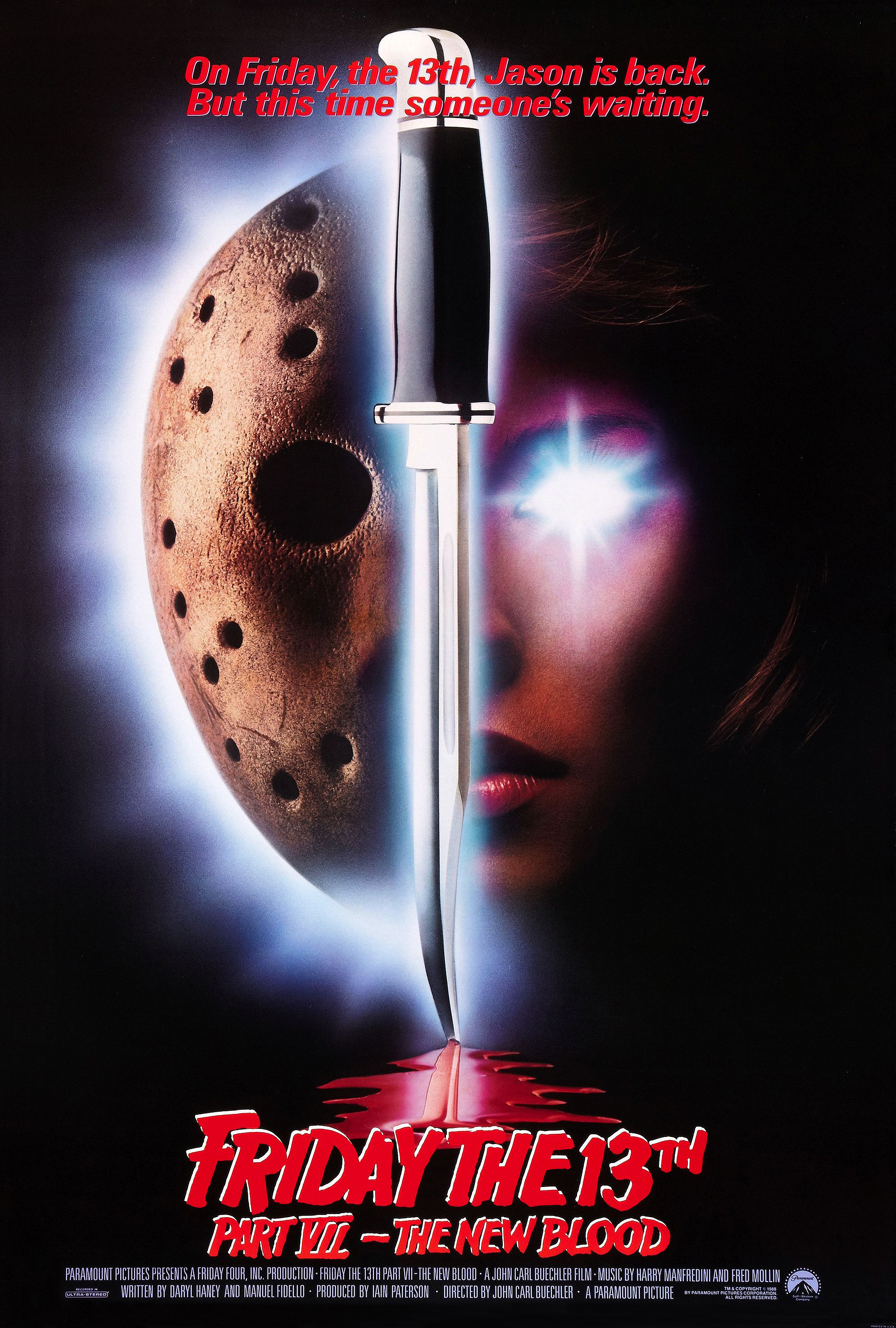
1. Friday the 13th Part VII: The New Blood (1988)
Sometimes a poster comes along that needs no explanation. It just leaps out at you. Mesmerises you on a purely visual level. And that’s certainly the case with the below image, which tops our list for pure aesthetic prowess. It doesn’t possess the same level of cute symbolism, humour or commercial wallop as some of its predecessors, but if you were to walk into a VHS store laden with promotional material, you know it would jump right out at you. It’s absolutely gorgeous.
Ironically, the severely anemic Friday the 13th Part VII: The New Blood typically ranks somewhere near the bottom when it comes to ranking the Friday the 13th movies, which is a terrible shame when you consider what could have been. After Jason Lives‘ Tom McLoughlin was overlooked to his disbelief, it was left up to practical effects artist and Empire Pictures alumni John Carl Buechler to turn the series around. Jason Lives had performed poorly at the box office, though many place the blame squarely in the lap of A New Beginning, which not only pulled the rug out from under audiences with the introduction of a copycat killer, but also ditched the whole Tommy Jarvis angle in favour of Jason’s belated return.
As well as suffering from petty interference from producer Barbara Sachs, who set out to sabotage the production after Buechler went over her head in order to quash her negative influence, The New Blood was absolutely savaged by both Paramount and the MPAA, the majority of the movie’s kills sluicing through the cutting room floor like so much rotten flesh. If you want a glimpse at what the movie should have looked like, check out the raw footage on Youtube. It may be robbed of post-production magic, but in terms of creative kills it had so much potential.
Beyond a deliciously madcap finale, The New Blood was nothing short of a disaster, but bad situations often create things of beauty, and the above promotional poster, though failing to boost box office numbers as the genre headed for total castration, is a cherished horror artefact for lovers of all things 80s. It also presents the film’s central gimmick rather well, Jason forced into battle with telekinetic warrior and Carrie clone Tina Shepard after Paramount had failed in their first attempt to strike a deal with New Line Cinema for a Freddy vs Jason crossover. The movie does nothing to live up to the supernatural image and cerebral promises of the poster’s visual concept, but its aesthetic qualities certainly fooled me into a viewing, close to a dozen in fact.
Maybe there’s something supernatural at work after all.


